Outdoor Experience
Interactive Design Prototype
I was required to create two homepage mockups using Figma, starting with wireframes from a previous activity.
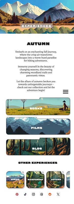
The mockups needed to incorporate the provided logos, visuals, and text, capturing the themes requested by the client.
The designs had to appear as fully functional, complete products, including proper buttons, icons, colours, and text, as well as showcasing the site’s navigation.
Tools

Figma

Freeform

Unsplash
1. Objectives
To transform a static mockup into an interactive prototype.
To design three pages (homepage and two additional content pages) for three device sizes: desktop, tablet, and mobile.
To ensure designs align with user personas and user stories.
To follow a full design process from inception, sketching, and wireframing to the final prototype.
To create and publish a finalized interactive prototype.
2. Project Overview
Client Context: Building upon the previously designed homepage mockups, this project expanded the scope to include multiple pages and device sizes, guided by user personas and stories.
Task: Deliver a comprehensive design prototype that demonstrates usability, accessibility, and interactivity across all devices.
3. Design Process
Phase 3.1: Inception and Planning
Reviewed client requirements and assets to establish design goals.
Analyzed user personas and stories to ensure user-centered design decisions.
Phase 3.2: Sketching and Wireframing
Created initial sketches for homepage and two content pages.
Developed wireframes for desktop, tablet, and mobile to map layouts and interactions.
Phase 3.3: High-Fidelity Mockups
Designed polished mockups for:
Homepage.
Two additional content pages (e.g., Experiences and Blog).
Adapted layouts for desktop, tablet, and mobile while maintaining consistent branding.
Phase 3.4: Interactive Prototype Creation
Added interactivity to simulate navigation and functionality, including clickable buttons, menus, and transitions.
Published a functional prototype showcasing realistic user interactions.
#40B4F2
#98CAE1
#001834
#FFFFFF
#E0E7EB
#000000
###
###
9:41
9:41
###
###
9:41
4. Key Features
Responsive Design: Nine designs created for three pages across desktop, tablet, and mobile.
Persona-Driven Decisions: User personas informed content prioritization, navigation, and interaction design.
Interactive Prototype: Fully clickable prototype simulating user experience.
Comprehensive Design Process: Followed a structured approach from initial sketches to final delivery.
5. Challenges and Solutions
Challenge 1: Balancing design consistency across three device types.
Solution: Used a robust design system and adaptive layout principles to ensure harmony.
Challenge 2: Maintaining user-centric focus while adapting content for multiple devices.
Solution: Referred to user personas and stories to prioritize content and interactions.
6. Outcomes and Learnings
Delivered a functional, responsive prototype meeting client and user needs.
Strengthened ability to design across devices while maintaining a cohesive user experience.
Enhanced proficiency in creating user-centered designs informed by personas and stories.

9:41

Macbook Air


